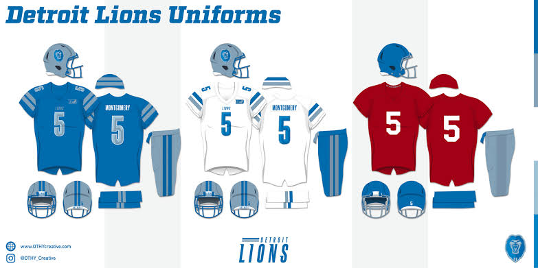
In a creative rebranding concept crafted by Timothy Batzinger for UniWatch, the Detroit Lions receive a fresh yet historically rooted visual update. While this redesign is speculative, it offers a glimpse into a potential future for the team’s identity, mixing both new elements and elements that pay tribute to the franchise’s storied past.
Batzinger’s rebrand is heavily influenced by Detroit’s automotive heritage. The proposed logo reimagines the team’s emblem with sleek lines inspired by automobile hood ornaments, blending modern aesthetics with a nod to the team’s origin. The lion’s head logo takes inspiration from the team’s early branding, while racing stripes are added to reflect a nod to the ’60s and the Lions’ brief use of a blue alternate helmet.
The secondary logo is an exciting new addition, featuring the silhouette of a lion over the letter “D,” complemented by stripes to suggest movement and speed. This is a reference to Detroit’s association with progress and innovation. A particularly touching inclusion is the proposed tribute to William Clay Ford, the team’s late owner, with his initials “WCF” stacked next to a lion, cleverly integrated into the letter “D.” This serves as a respectful homage to his influence on the franchise.
In terms of uniform changes, Batzinger’s design strikes a balance between simplicity and tradition, with some modern twists. The racing stripes from the new logos are carried over into the uniform design, enhancing the cohesive feel. The numbers are given a beveled style, lending the jerseys a more contemporary, sharp look. Notably, a tribute to William Clay Ford would appear on the left chest, ensuring his legacy remains prominent in the team’s visual identity.
One of the standout features of this concept is the return of red jerseys, which the Lions haven’t worn as part of their regular uniform set since 1955. Red has been a part of the team’s history, and its reintroduction as an alternate jersey option offers fans a new way to show their team spirit.
The rebrand also takes inspiration from the Lions’ 1953 NFL Championship victory, with a throwback design representing the first season the team wore a uniform outside of their traditional gray and blue. This reimagined design ties the team’s past successes to its future, offering a stylish and historic alternate uniform.
While this rebranding is purely hypothetical, it presents an exciting look at how the Lions could blend their rich history with a modern, forward-thinking identity. The racing stripes, updated logos, and the return of red jerseys highlight Detroit’s deep connection to its past while setting the stage for a future-focused brand. The introduction of the 1953 throwback design adds a nostalgic layer, celebrating the team’s historic championship achievements. Even though this concept is fictional, it offers an intriguing vision of what could be in the Lions’ visual future.